Redesigning a neighborhood’s website with its visitors in mind.


Getting every single detail right.
-
. Client .SDC Petite Italie
-
. Role .UX/UI Design
As part of SDC (Société de Développement Commercial) Petite Italie’s rebranding, the brand’s website's user experience and user interface has to be redefined. First, the website’s structure is put in place in order to make it user-friendly while meeting the target’s audience needs and expectations in terms of content. As for the user interface, the focus is set on illustrations to bring an added value to the website’s design and make Little Italy stand out within Montreal’s commercial landscape. Finally, the development of an advanced SEO strategy allows the website to be easily findable and increase its ranking on Google search.
. USER EXPERIENCE (UX) .
- // Website Structure & Wireframe Design
- // Website Navigation & UX
- // Development of a Responsive Website
- // Custom Front-end & Back-end Development
- // Advanced SEO Strategy
. USER INTERFACE (UI) .
- // Research & Mood board
- // Graphic Design
- // Image and Typography Selection
- // Color Palette Selection
- // Production of Digital Illustrations

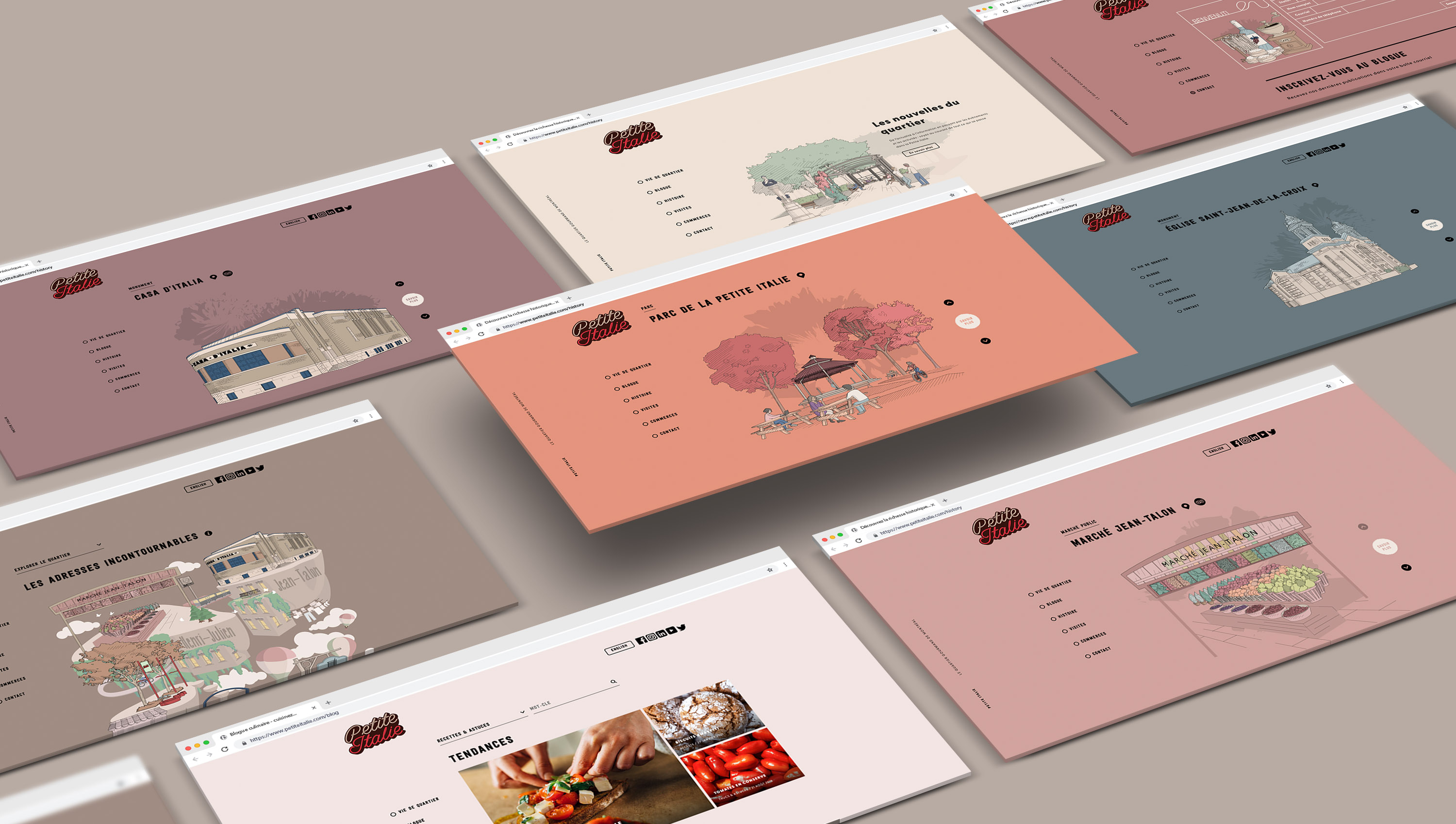
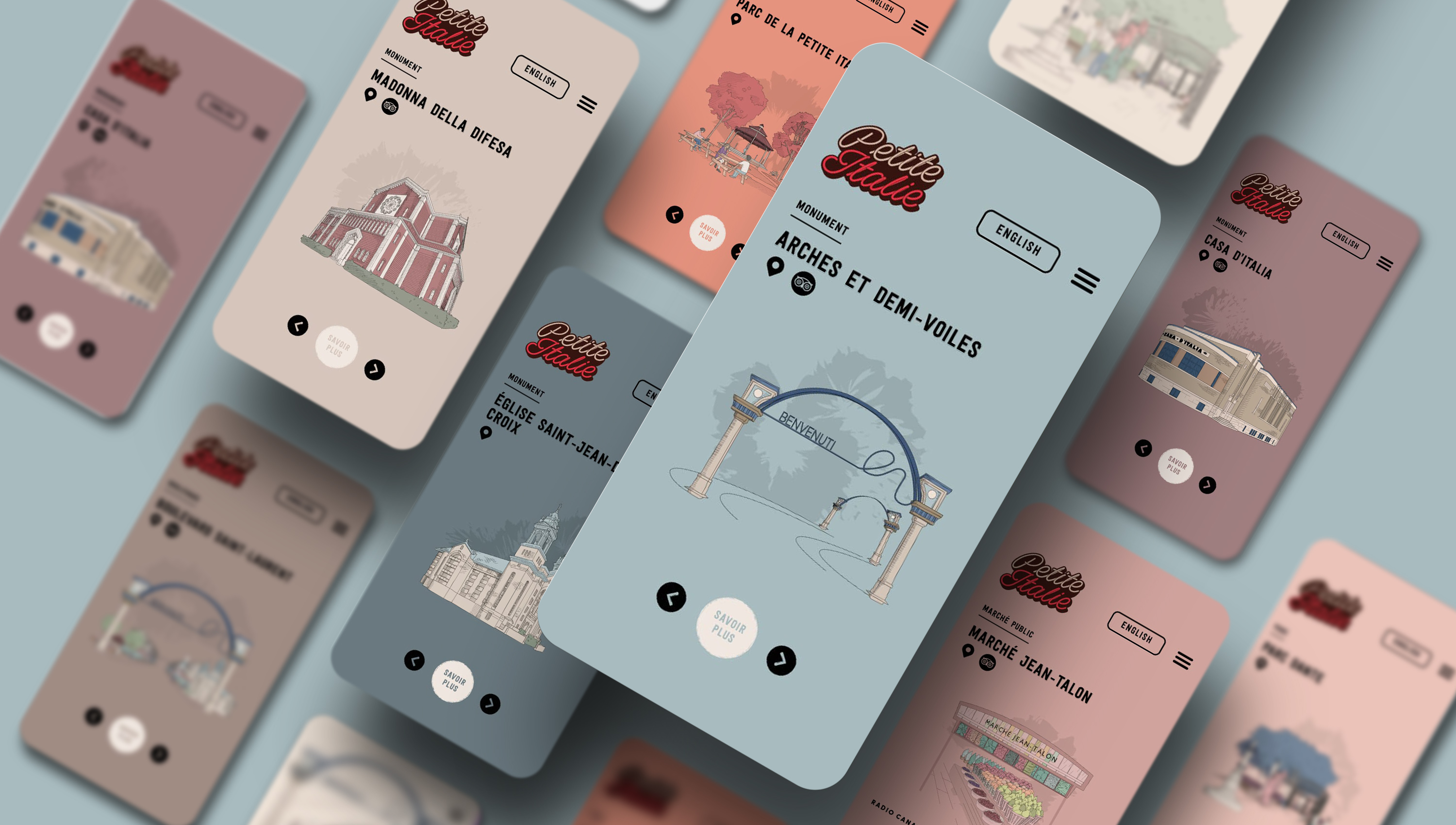
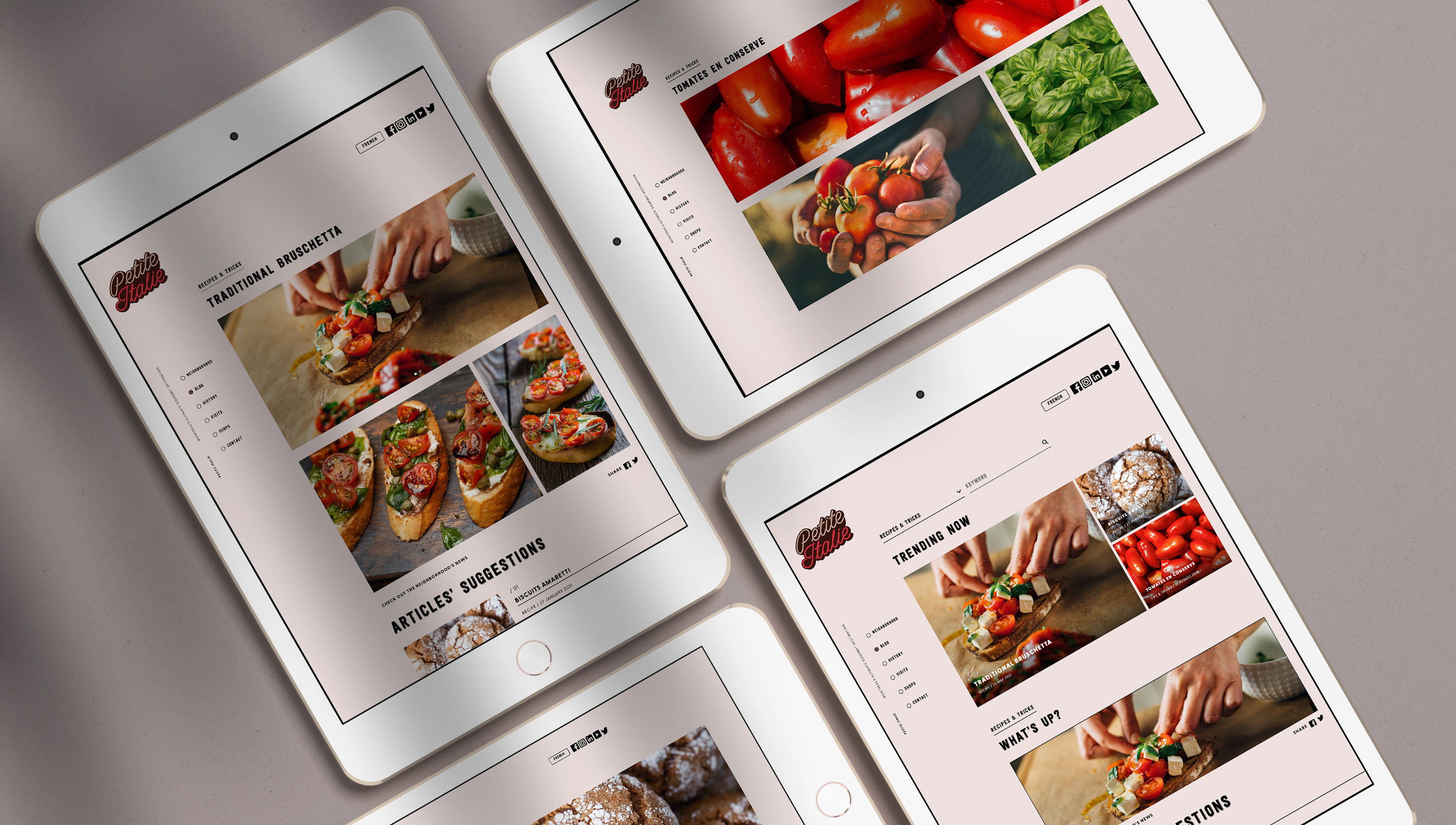
A website tailored to everyone’s needs.
Having analyzed the weaknesses of SDC Petite Italie’s old website, it is clear that the latter can't retain existing users and has a high bounce rate. In order to solve these strategic problems, the new website has to be useful and desirable. Therefore, the brand’s different target audiences are identified and the website’s pages and sections is decided accordingly. In other words, each page is designed in a way that reflects its own audience in terms of interest. Every single detail is thought out to make Little Italy’s website useful, accessible, and valuable in the eyes of the users.
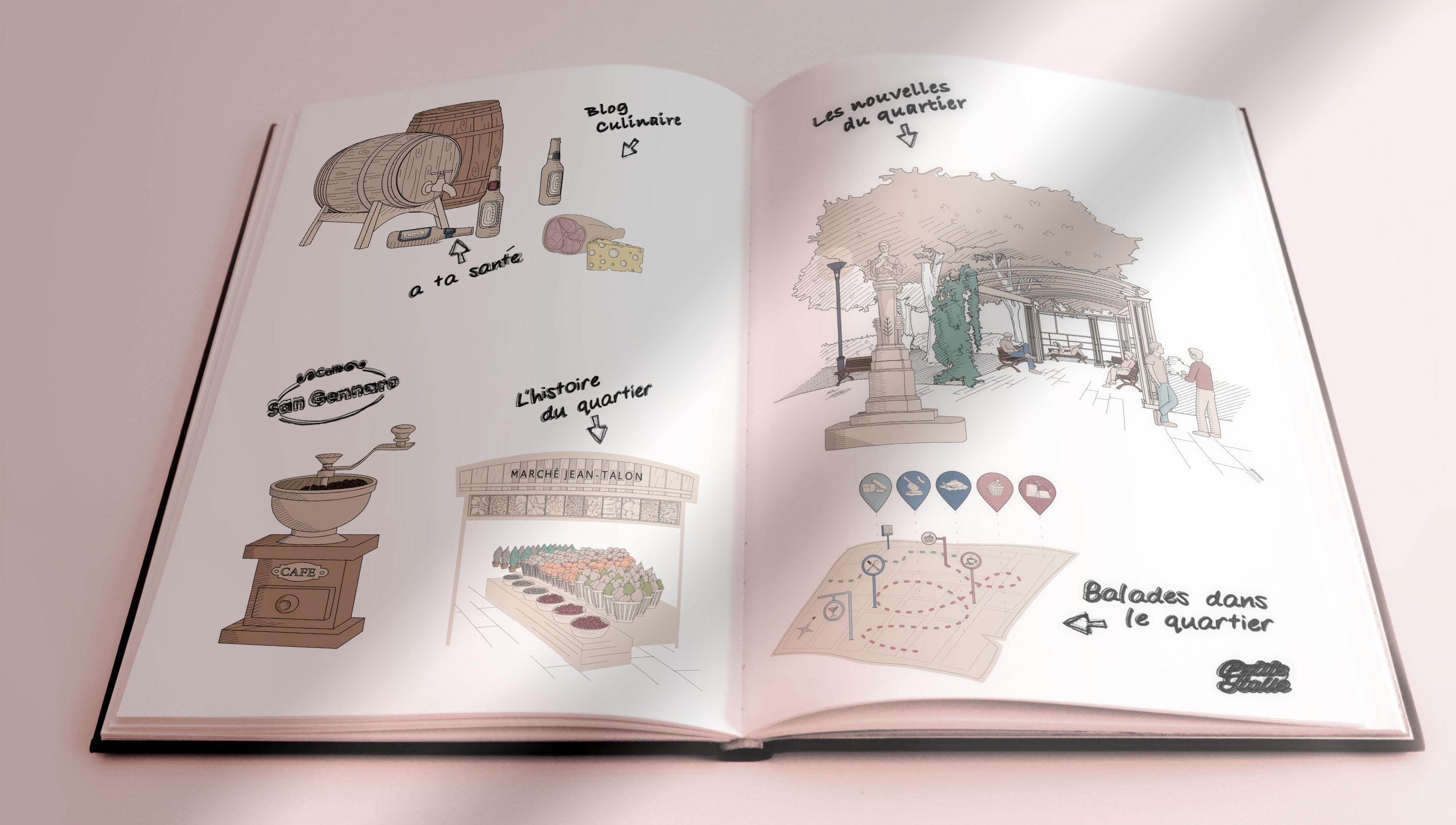
Postcards from Little Italy.
It is important to design a website that reflects the core values and DNA of Little Italy. There is no better way to bring out the neighborhood’s merchants’ authenticity and craftsmanship than with hand-drawn illustrations. After working on a detailed mood board, a series of tests on different illustration styles and color palettes are carried out in order to decide on the right ones. By reproducing Little Italy through illustrations, the audience is taken on a unique journey through a historical and rich neighborhood.

Getting the audience on board.
To make the website useful and desirable, an interactive map is designed to enable the users to plan activities in the neighborhood based on their interests. The illustrated maps are real representations of the neighborhood, including signages, transportation, shops and landmarks. Additionally, hand-drawn icons are designed to represent the specialty of each shop in a way to help the visitors easily spot their favorite shops and places. Finally, to make the page more dynamic, the users are able to navigate on Google Maps in real time to reach their desired destination.
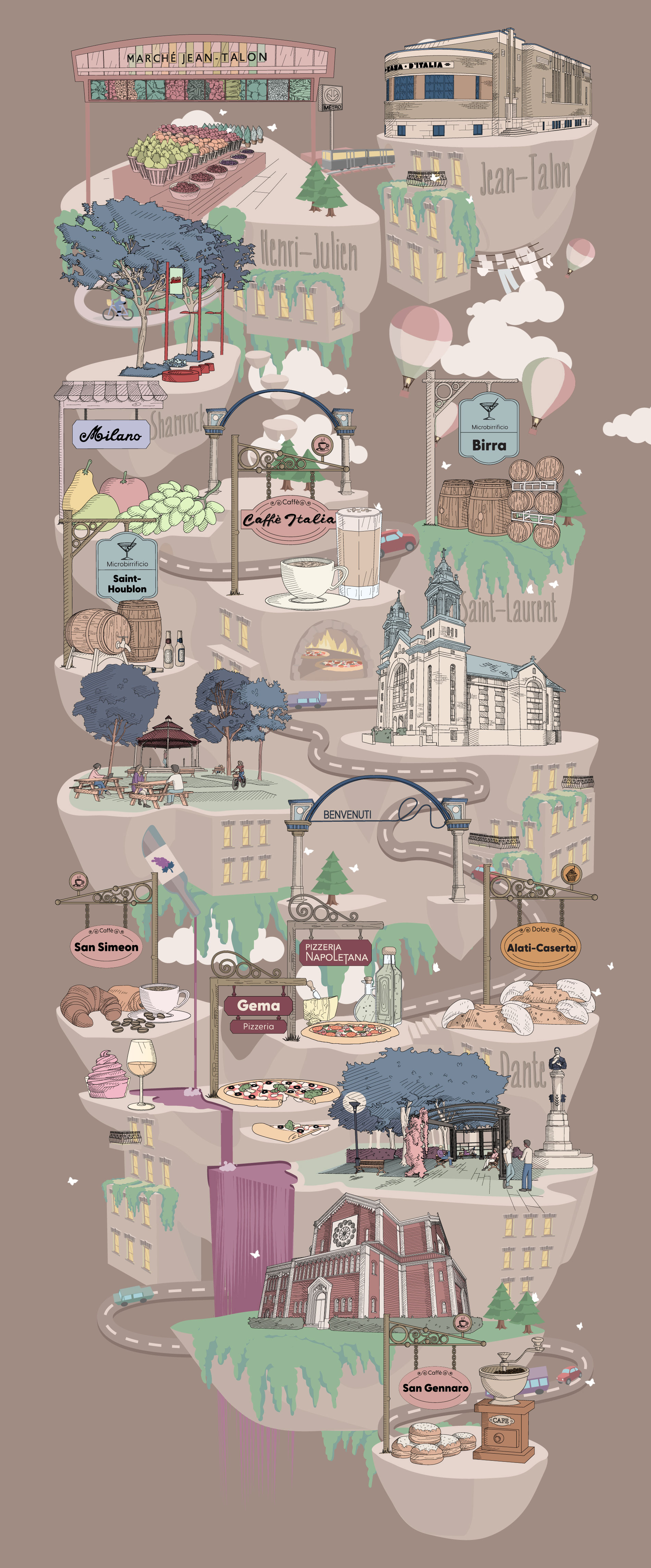
// Illustrated Map