Leaving a digital print on the tech world with a dynamic rebranding.


A new identity born under the digital sign.
-
. Client .Omnigo.ca
-
. Role .Visual Identity
Omnigo.ca is a young tech firm specialized in web development and digital marketing. Since its creation, the brand lacks definition and seems lost in a crowd of competitors. In order to differentiate itself visually and to increase its awareness, Omnigo.ca wishes to develop a new visual identity that will not only set the company apart, but that will also represent its personality and values.
. LOGO CREATION .
- // Logo Design and Execution
- // Typography Selection
- // Color Palette Choice
- // Logo Animation
. GRAPHIC DESIGN .
- // Social Media Branding
- // Communication Tools Development
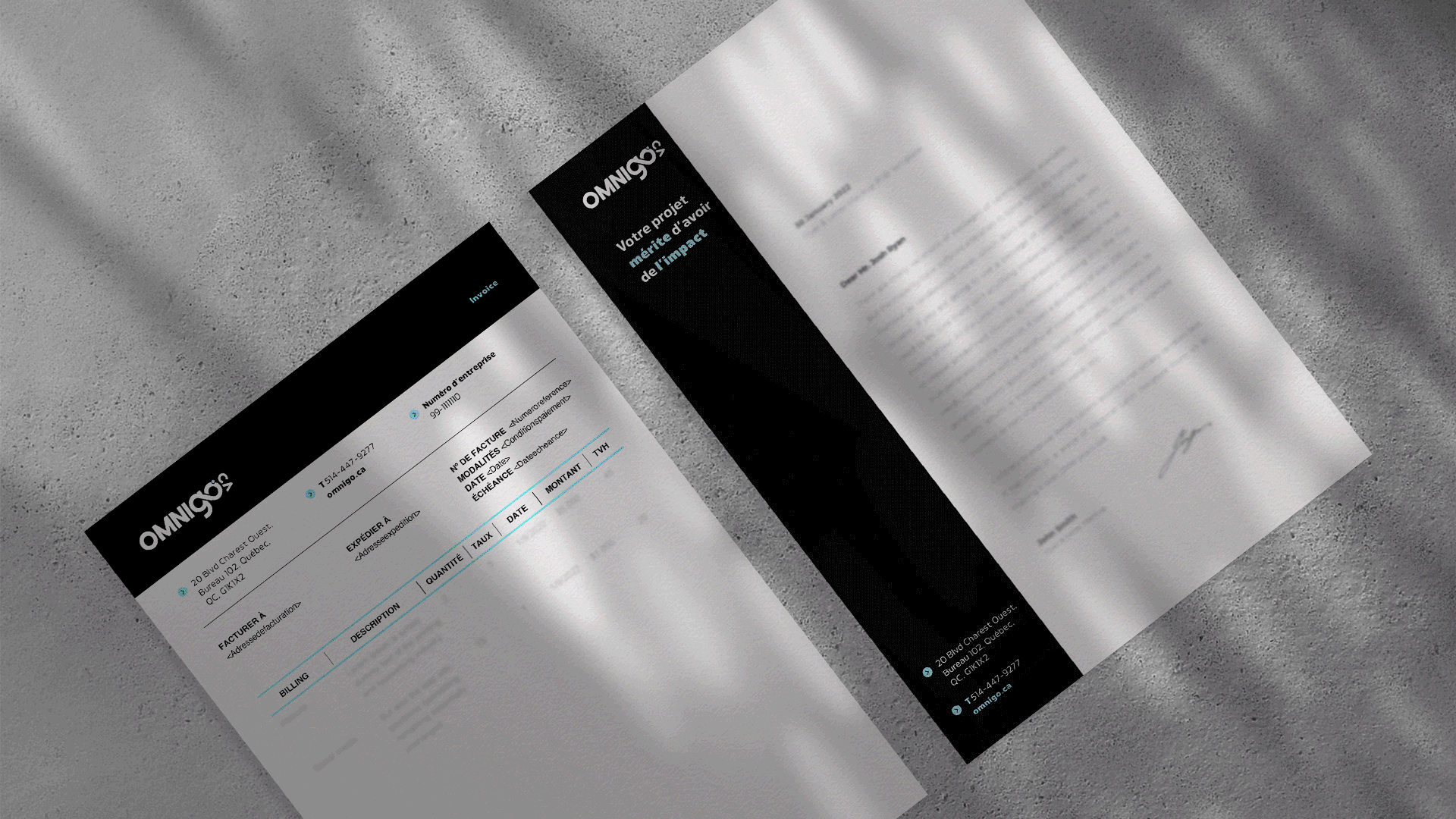
- // Corporate Documents Design
- // Brand Guidelines Development

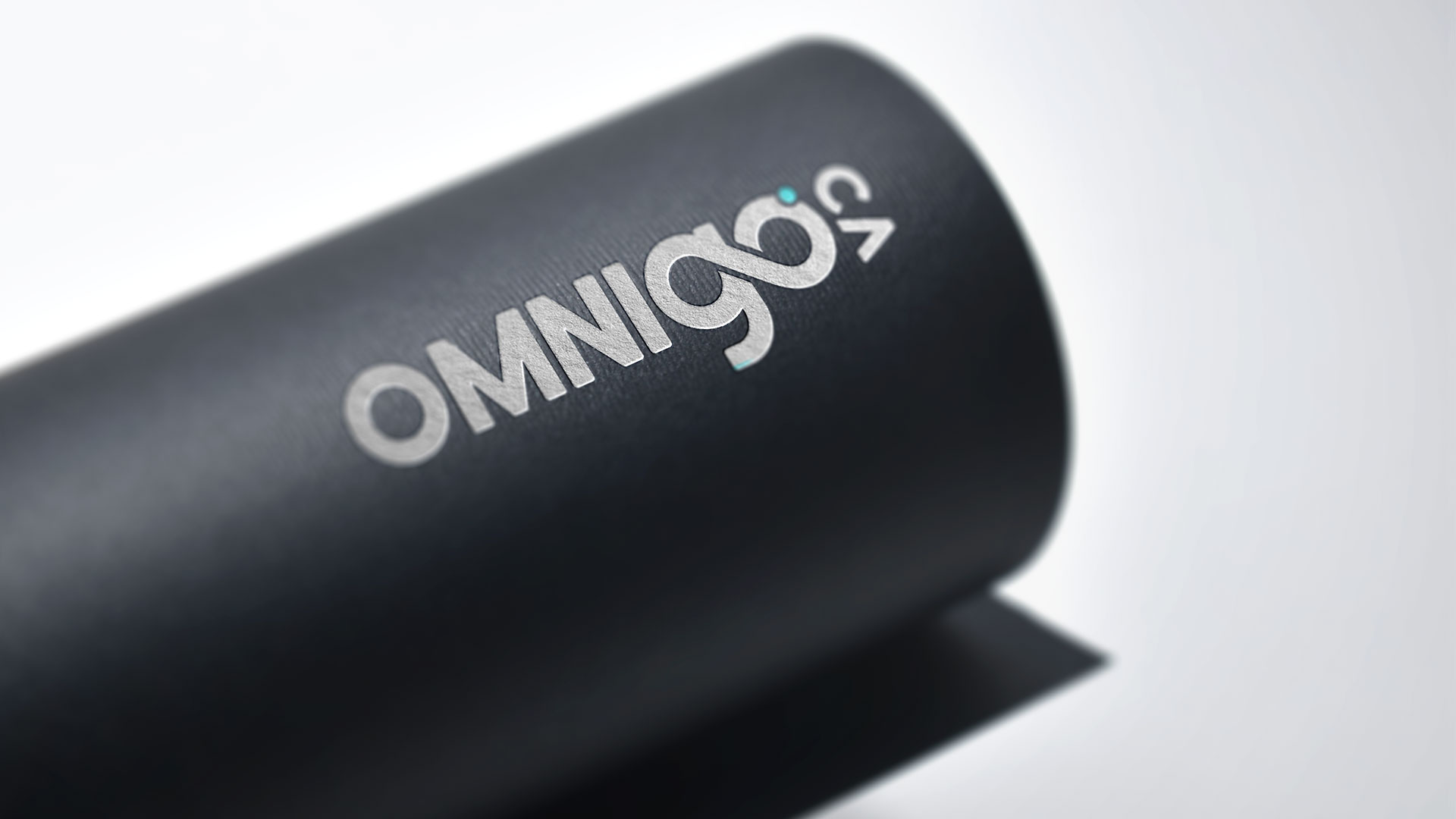
// Logo
The idea behind an identity.
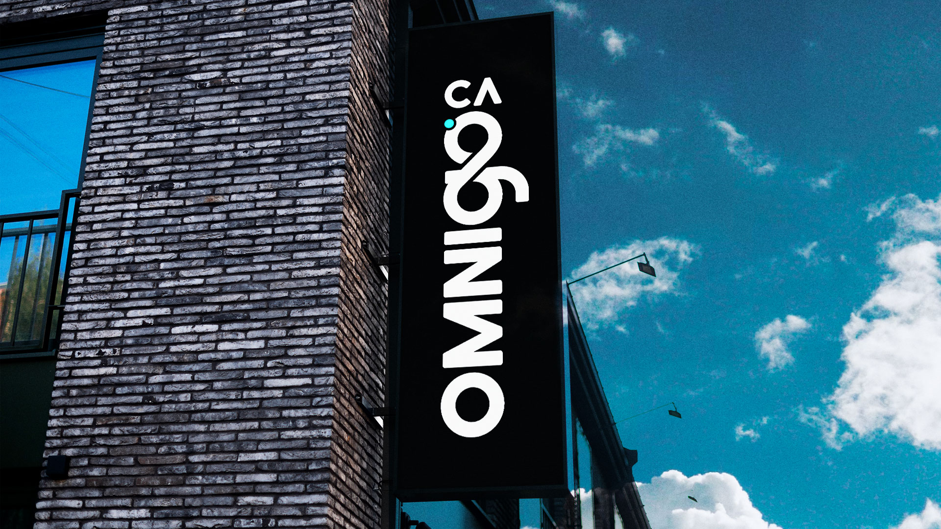
Before starting the rebranding process, Omnigo.ca is put under the microscope. It is essential to define the brand's personality before moving to creative execution. The company's mission, vision and values are determined in order to position Omnigo.ca as the technological partner of choice focused on client servicing. What differentiates the brand from its competition is the importance given to long-lasting relationships with its clients that is showcased in the new logo through the infinity symbol.

// Étude du logo
A simple, memorable and resizable logo.
A good logo must be SMART: Simple, Memorable, Appropriate, Resizable and Timeless. Unfortunately, that wasn't the case of Omnigo.ca's old logo which was making it difficult to use.These 5 key criteria guide the creation of the brand's logo, keeping in mind an essential point: its deployment on different channels, especially the digital ones. The new logo is modern and representative of the brand, and takes into consideration Omnigo.ca's specific needs in its new brand guidelines.

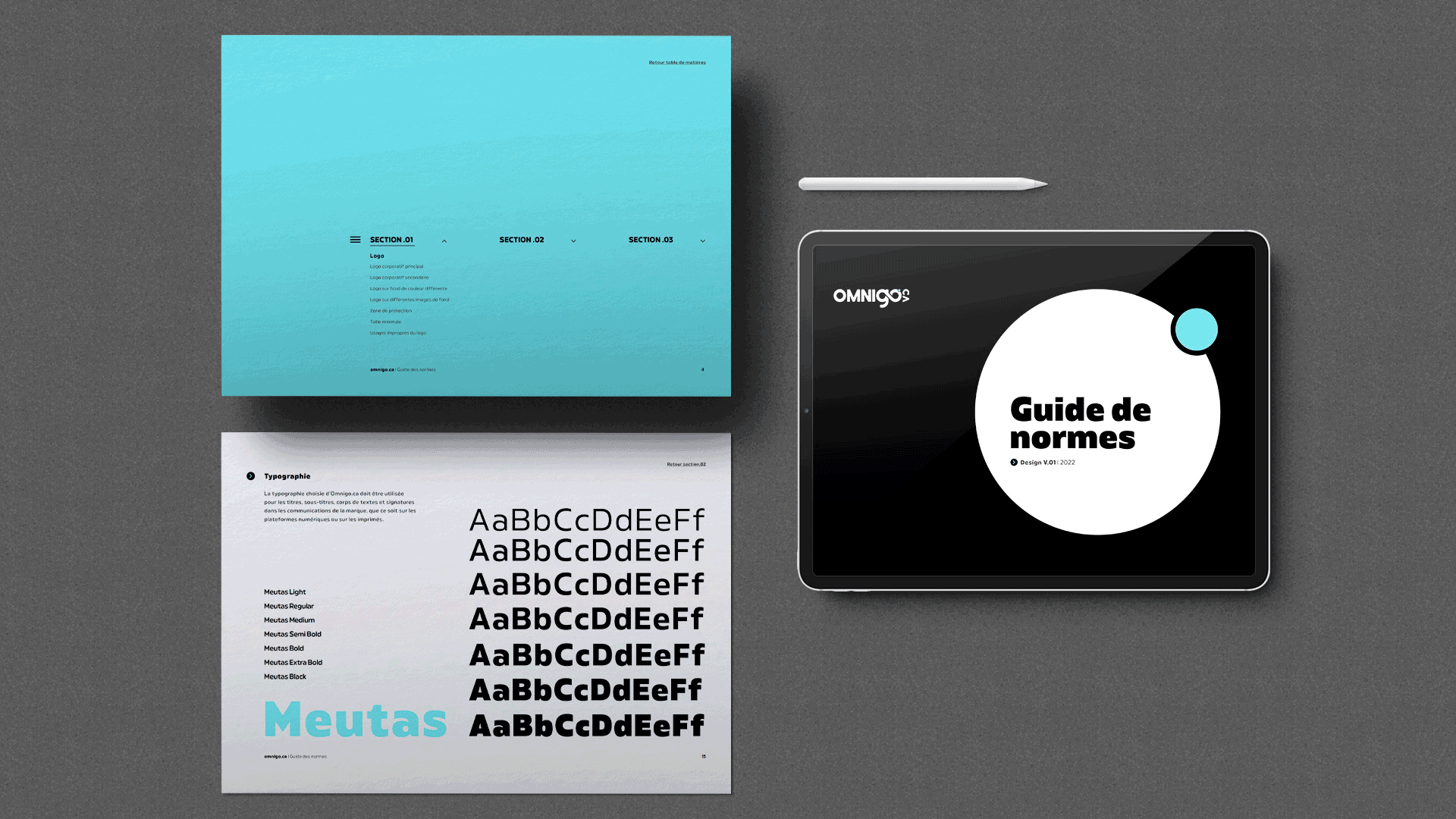
// Guide de normes

New image, new impulse.
Omnigo.ca's new identity reflects its industry: modern and trendy. This can be observed in a bold and imposing typography and a strong color palette. The black and white look represents the digital world's simplicity and modernity, and the color blue symbolizes the trust between the brand and its clients. Through its new visual identity, Omnigo.ca transforms into a recognizable brand that is easily recognizable on its different digital and traditional channels.