Restoring the harmony between a neighborhood’s personality and its visual identity.


A brand worthy of Little Italy.
-
. Client .SDC Petite Italie
-
. Role .Visual Identity
Based on the outcome of the positioning study carried out for SDC (Société de Développement Commercial) Petite Italie, the main conclusion is that the brand’s identity is not representative of its neighborhood. To solve this strategic issue, a new brand identity that meets the SDC’s vision as well as the neighborhood’s positioning is designed with the aim of highlighting Little Italy's DNA and personality.
. LOGO CREATION .
- // Logo Design
- // Typography Selection
- // Color Palette
- // Brand Guidelines
. VISUAL IDENTITY .
- // Research & Moodboard
- // Design of Corporate Documents
- // Stationery Design
- // Production of Digital Illustrations
From identity discordance to visual coherence.
SDC Petite Italie’s brand image is highly inconsistent due to the plurality of logos and visual styles displayed in its area.The main challenge is to meet the different strategic objectives by aligning the SDC’s actions and decisions with its positioning in order to build a strong and recognizable brand. With that in mind, a strong visual identity is created to make the neighborhood stand out from other neighborhoods in Montreal, and to ultimately allow the SDC to restore its credibility towards its members, target audiences and competitors.


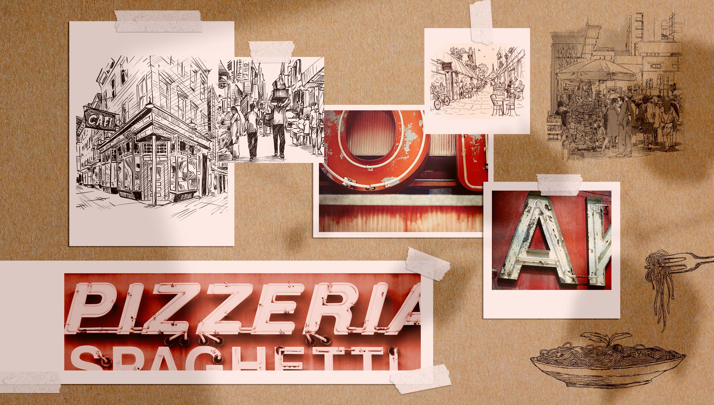
Italy at a glance.
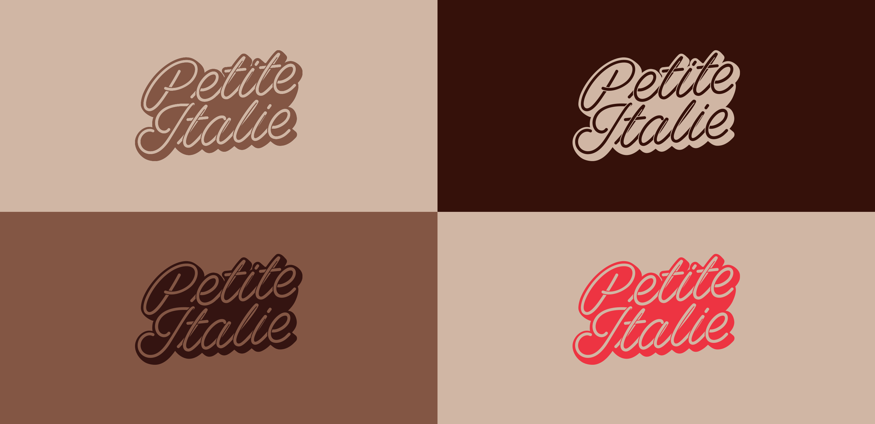
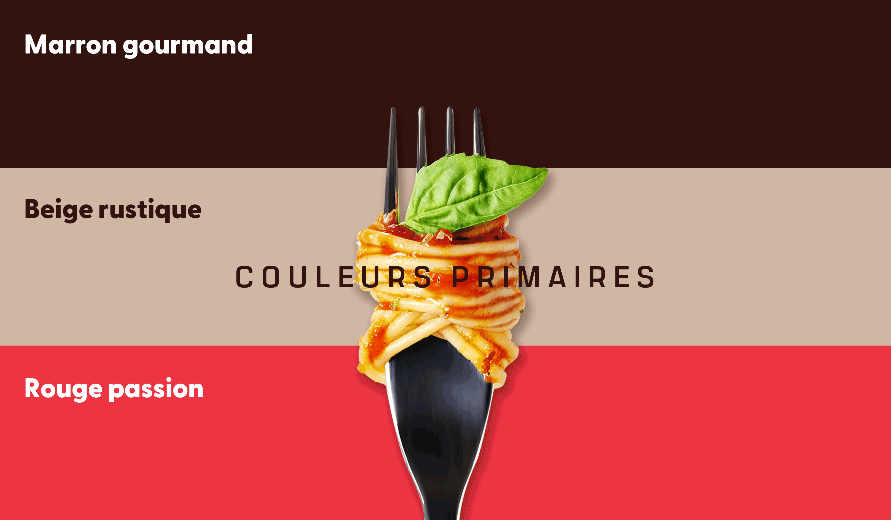
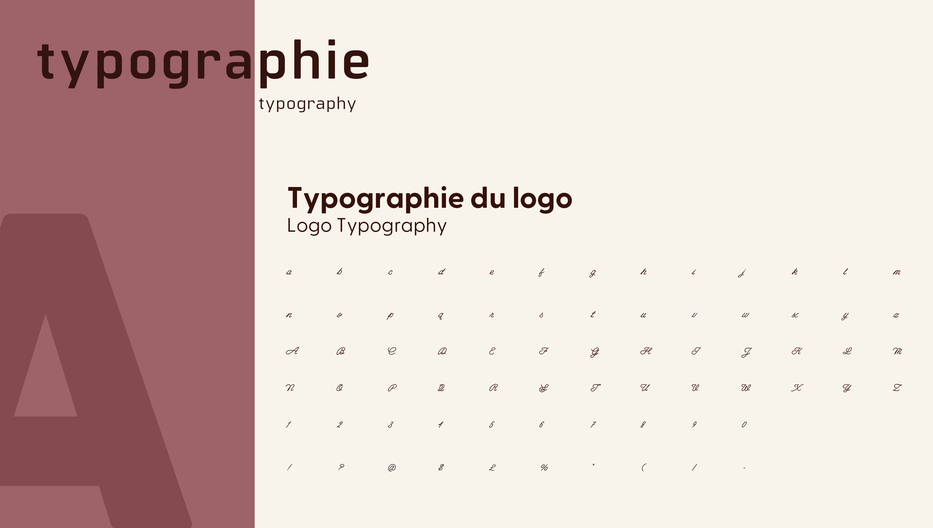
Built by Italian immigrants over a 100 years ago, Little Italy has preserved Italy’s charm, values and rich culinary heritage. In fact, the neighborhood is known for its specialty food stores, public market, and outstanding restaurants and cafes in Montreal. Through its branding, it is crucial to highlight the neighborhood's food culture, especially since it is being positioned as “Montreal’s Ultimate Gourmet Destination”. To make Little Italy's branding unique, every single detail is carefully thought through from the logo to the choice of typography and color palette. The logo’s shape is inspired by traditional Italian commercial signs, and the chosen typography has a spaghetti form in order to highlight the famous Italian ingredient and one of the world’s most consumed dishes. Finally, a warm color palette that perfectly embodies Italy’s rich culture is adopted.

// Animated Logo
Anchoring authenticity with visual elements.
In the case of Little Italy, it is necessary to combine the traditional Italian side with Montreal’s charming vibe. For this reason, all the visual details are carefully designed in a way to reflect this very particular contradiction that makes the neighborhood so unique. Starting with the brand’s stationery, kraft paper is adopted to emphasize the neighborhood’s authenticity and highlight its craftsmanship. Going above and beyond standard branding, an illustrated world is created for Little Italy, a true added value in terms of visual identity that allows the brand to be easily recognizable within Montreal’s commercial landscape.

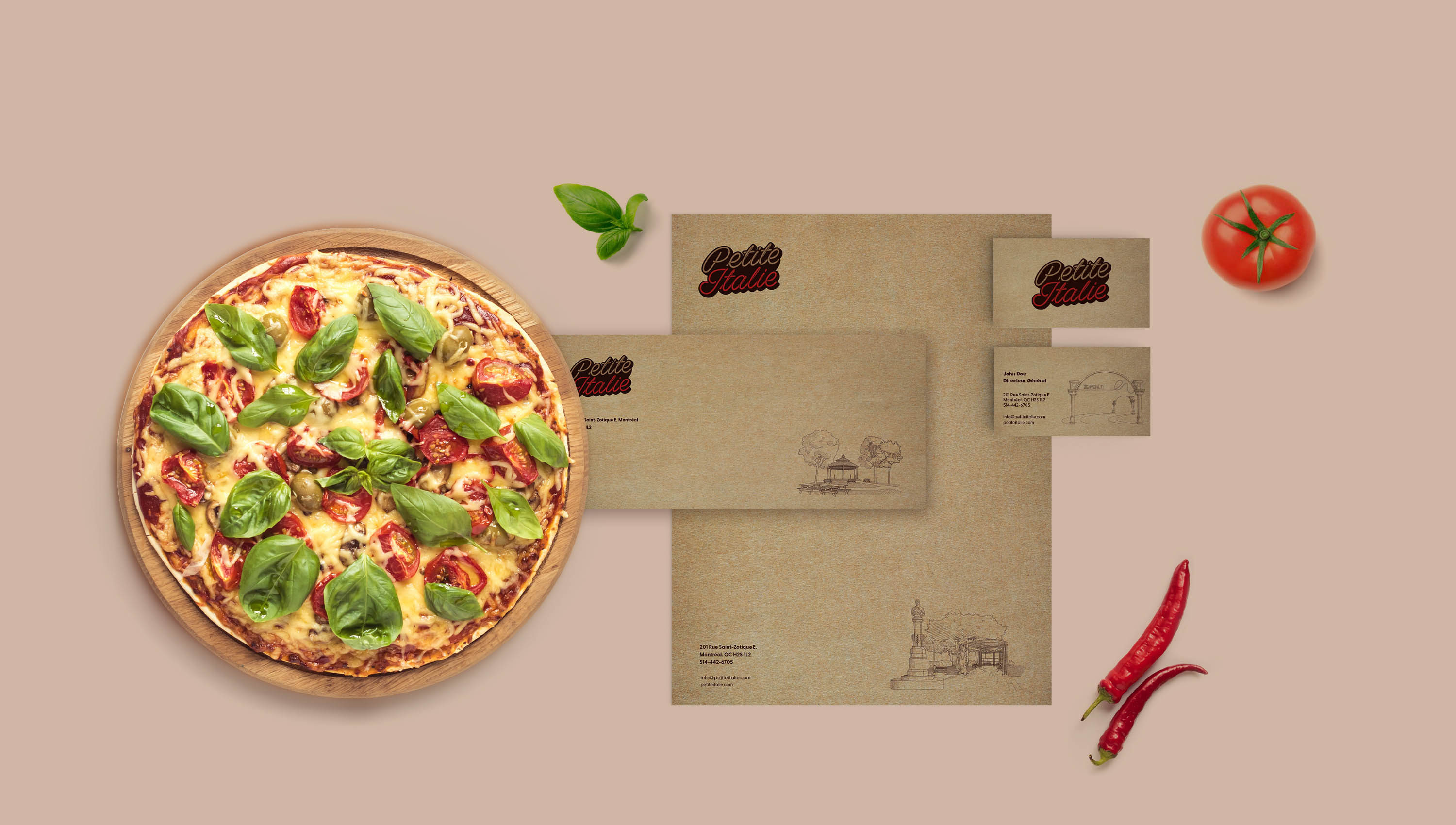
// Stationery
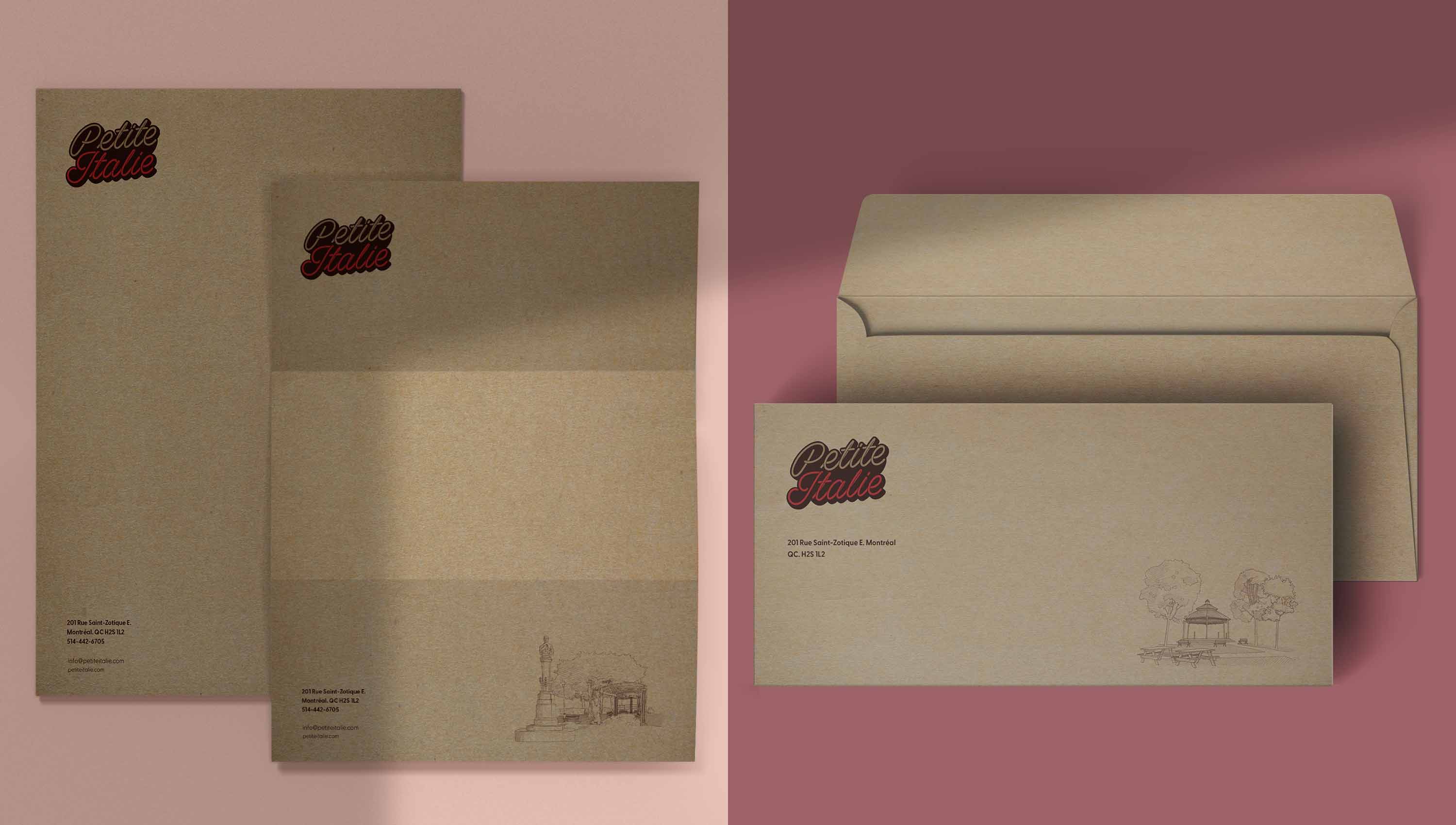
// Letterhead