Creating a remarkable brand identity for a boutique gym.


Fleshing out the brand’s identity.
-
. Client .THE LAB
-
. Role .Brand Identity // Space Design
As a newcomer on the fitness market, THE LAB wants to establish a strong visual identity before its official opening. Therefore, a 360-degree personality is built, corresponding with the brand's grungy DNA, its positioning, and the unique customer experience being offered at the premises. After highlighting the essence of the brand, a visual identity is developed to reflect the gym’s underground universe and premium experience. This is not merely translated into a logo and stationery design, but also injected in THE LAB’s onsite branding.
. VISUAL IDENTITY .
- // Logo Concept & Design
- // Brand Identity Development
- // Stationery Design
- // Brand Guidelines
- // In-Store Branding
. COMMUNICATION TOOLS .
- // Website Development
- // Logo Animation
- // Creative Copywriting
- // Content Writing
- // SEO Strategy
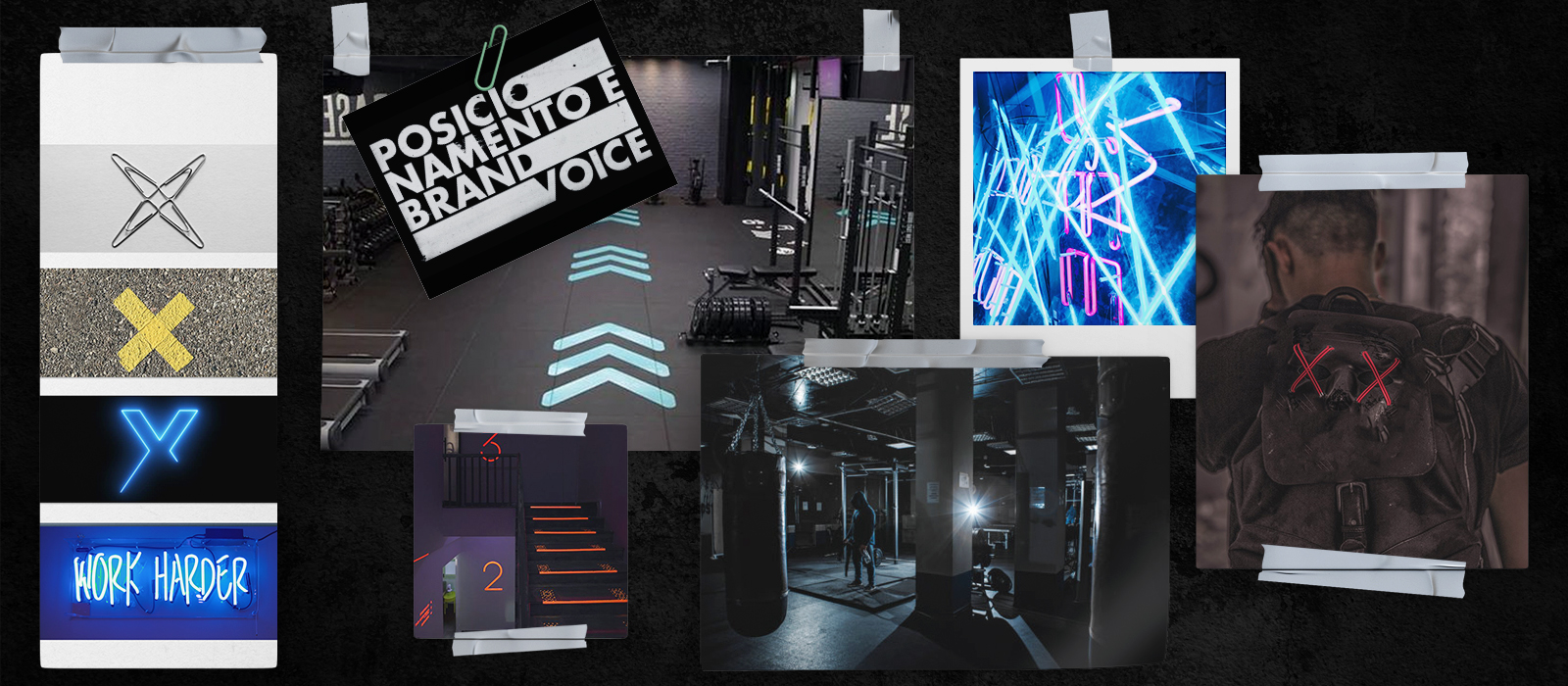

Put a face to the name.
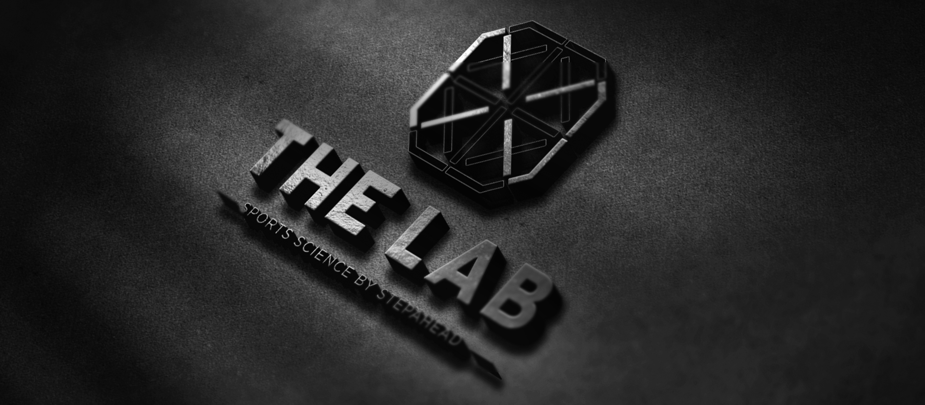
The grungy and underground look-and-feel of the gym’s floor is fully incorporated into THE LAB’s logo, graphic style, and color palette, favoring black and white and dark visuals. In fact, the X represents the no entry sign that is usually seen on the doors to scientific laboratories. It thus mixes the scientific approach adopted with the closed circle that gathers the gym’s community. The logo plays a crucial part in THE LAB’s brand strategy and is always present in the brand’s communications, whether as a part of the visuals - strategically placed in the background - or as a centered element itself.
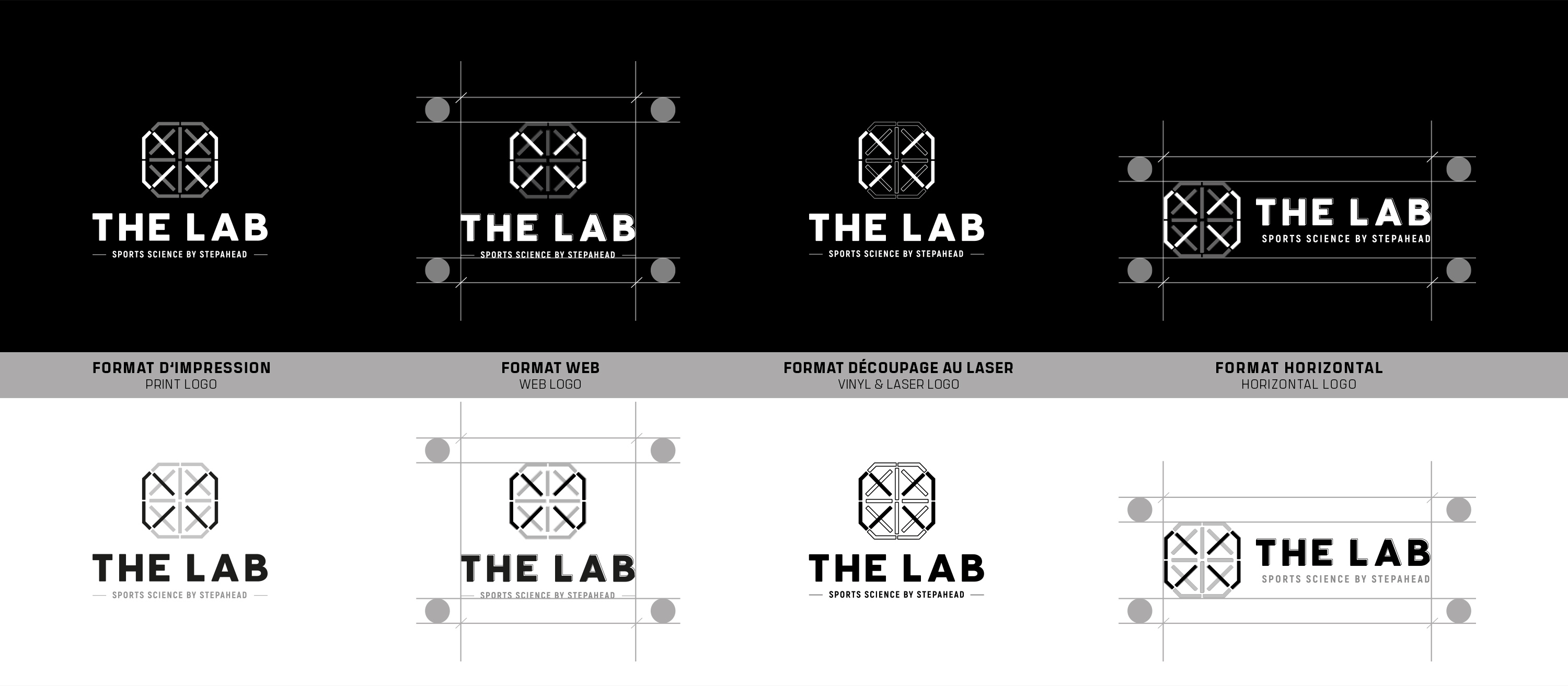
// Logo
When logo and space design intertwine.
On THE LAB’s road to in-store design, no stone is left unturned. With the logo being too imposing, it is necessary to go with a simple stationery design in order to highlight the brand’s grungy color palette and typography. The waiting room is also branded by adding lighting fixtures shaped like the logo and hanging the right images on the wall. Branded towels, locker numbers, pictograms and more came to complement the space design.

// Space Design
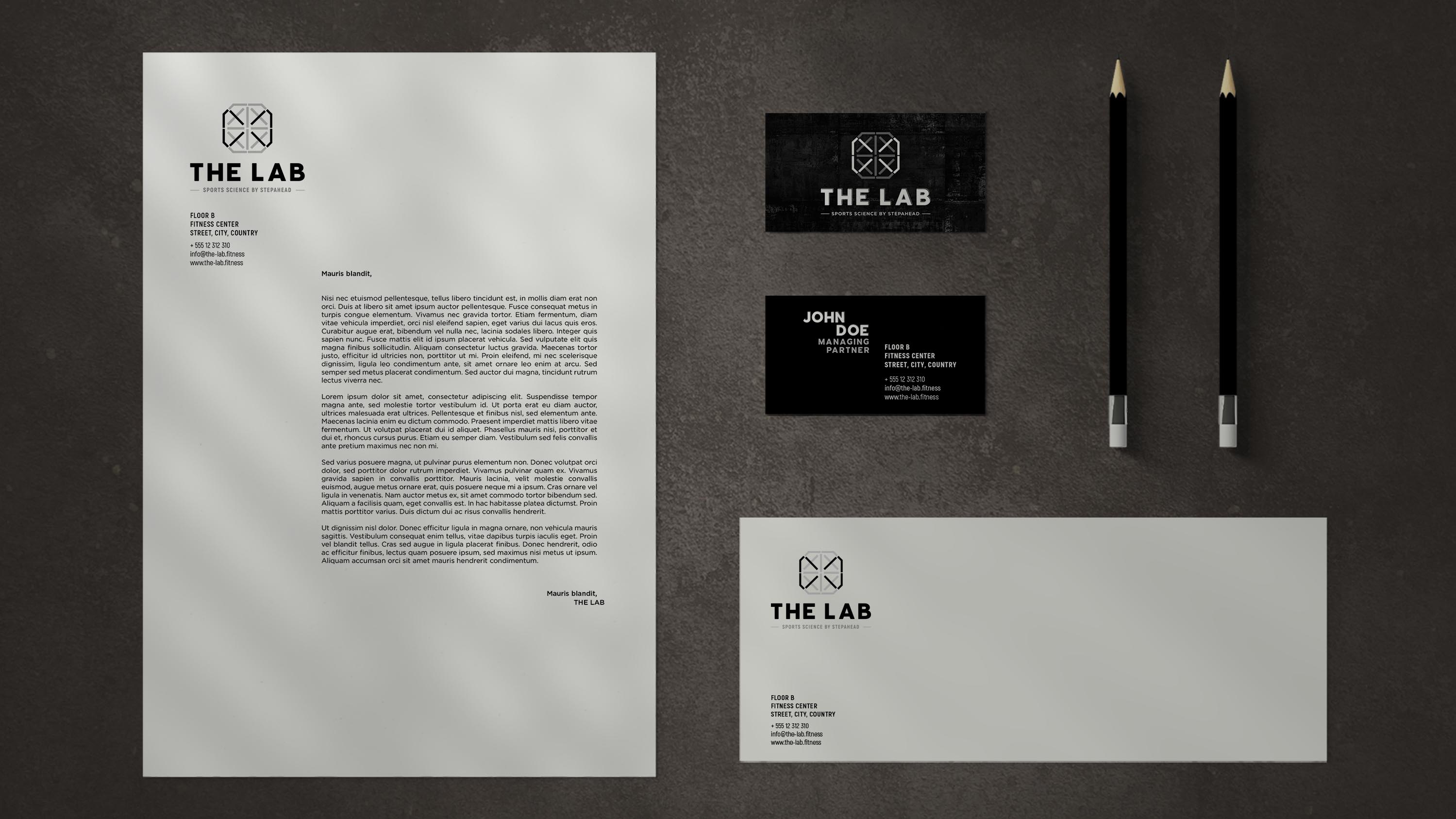
// Stationery
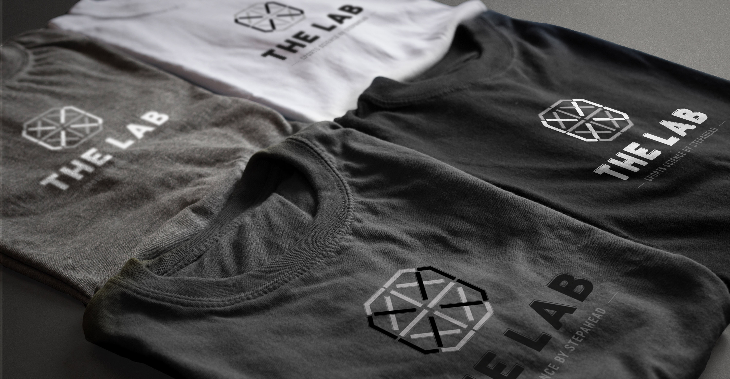
// Merchandising
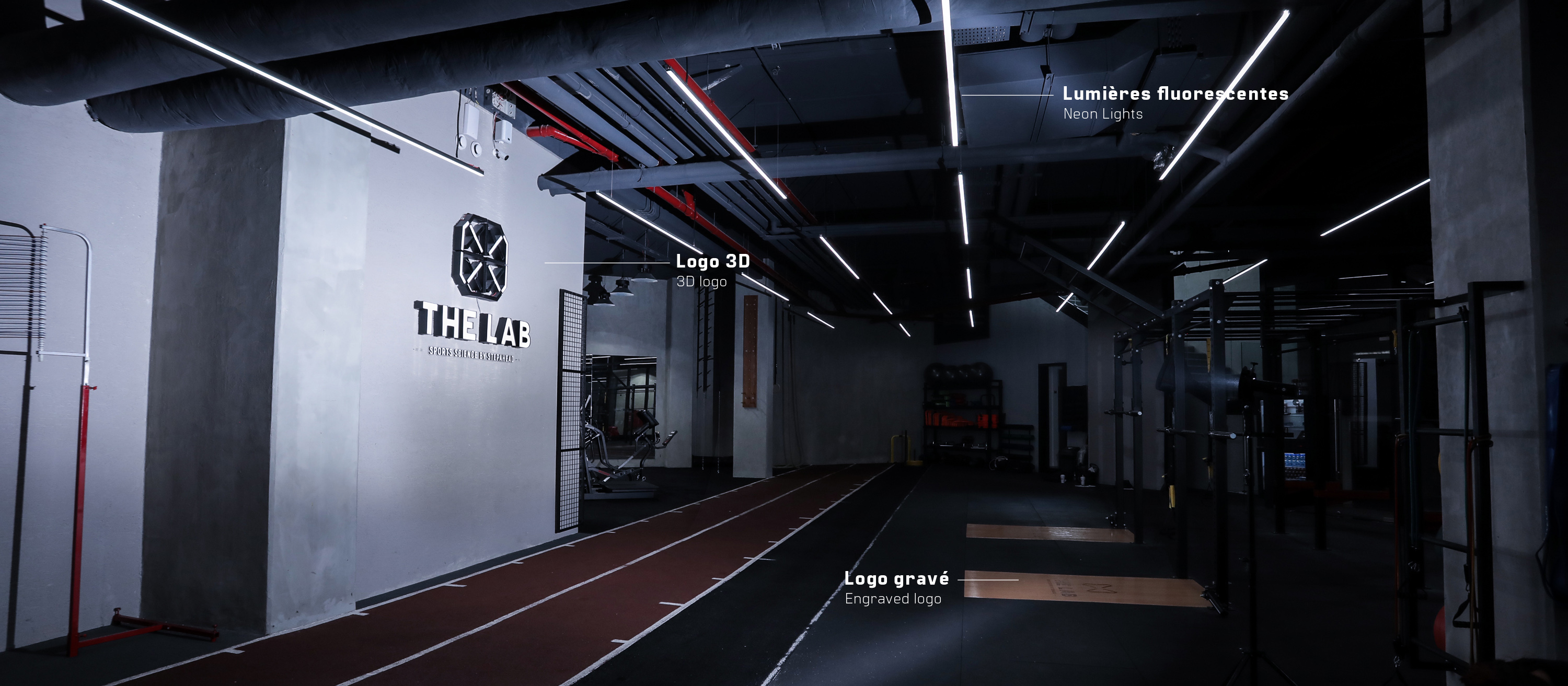
Implementing THE LAB’s in-store design.
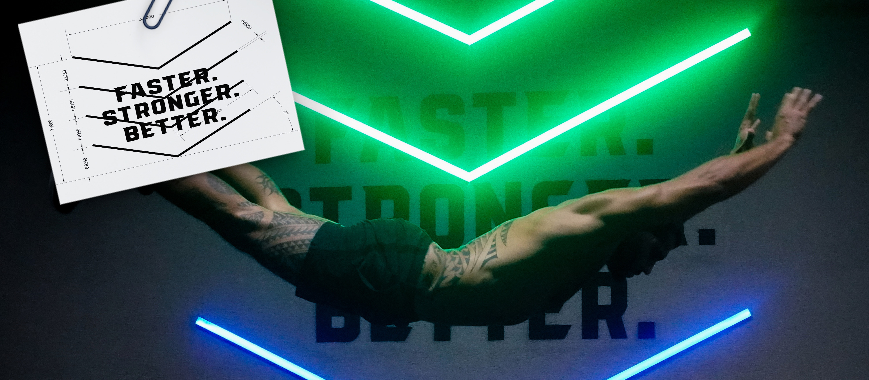
A true brand experience has to be felt within its premises. Talking about THE LAB, a name chosen in reference to scientific laboratories, the space design is set up in a way that reflects the essence of the brand, from the floor to the lockers and recovery rooms. To complement the “underground” character of the gym, colorful neon lights are designed and integrated into the gym floor along with the brand’s slogan “Faster. Stronger. Better.” A 3D logo is also added to highlight the brand's grungy DNA even more. The gym’s signage is another object of attention, placing signs outdoor and indoor, while focusing on signage to guide newcomers from the parking lot to the offices and the gym.