Reveal a local event’s new identity and promote it across multiple channels.


Blending tradition and modernity.
-
. Client .SDC Quartier D x Vert Cité
-
. Role .Advertising Campaign
“L’Érablière Urbaine”, one of Quebec's most beloved traditions, celebrates its 15th anniversary at Quartier D. On this occasion, the SDC (“Société de Développement Commercial”) Quartier D decides to partner up with Vert Cité in order to highlight this annual event and drive more foot traffic to the commercial street of Décarie. To promote this festivity more effectively, its visual identity has to be modernized while preserving its traditional and folkloric aspects. Through the events’ communications, its new modern and attractive brand identity is revealed while accentuating the roots of the event.
. VISUAL IDENTITY .
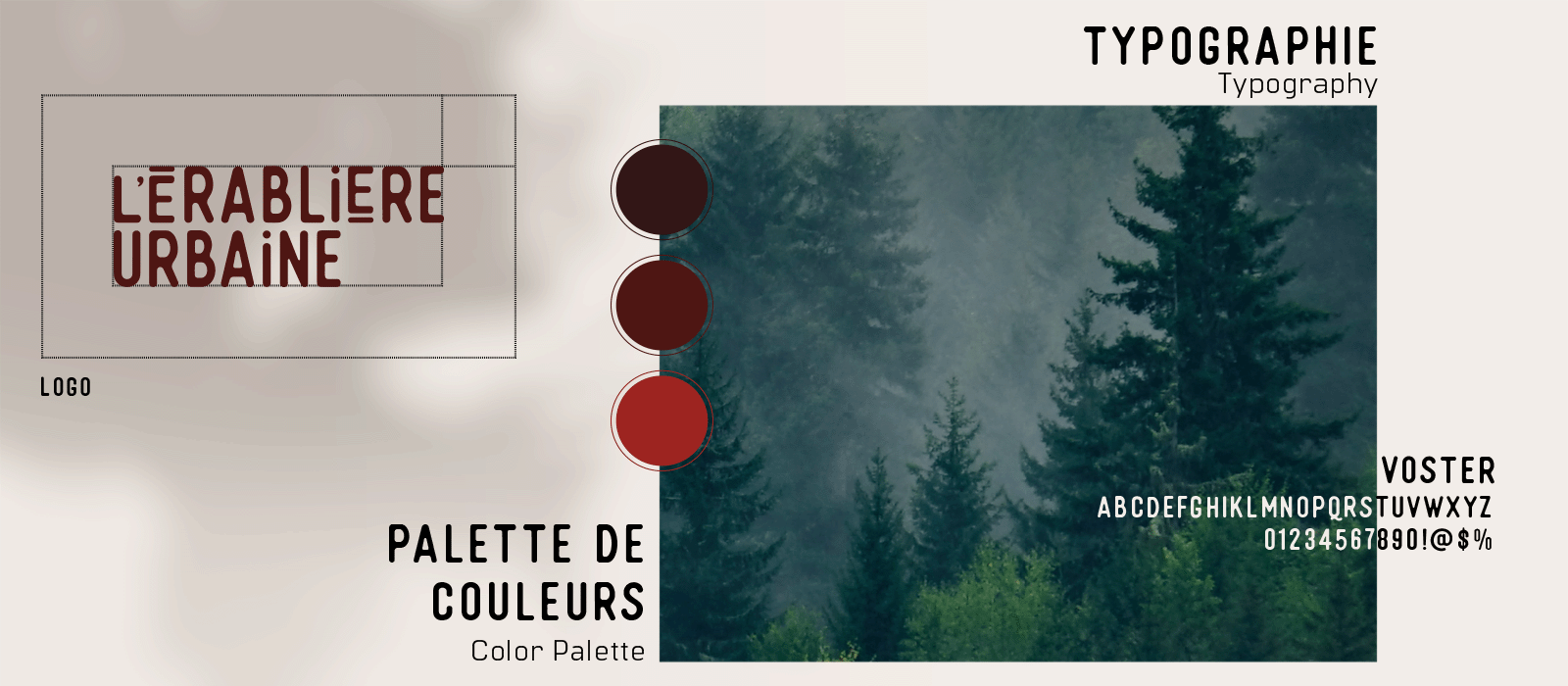
- // Typography Selection
- // Color Palette
- // Logo Design
- // Setting the Visual Style
. GRAPHIC DESIGN .
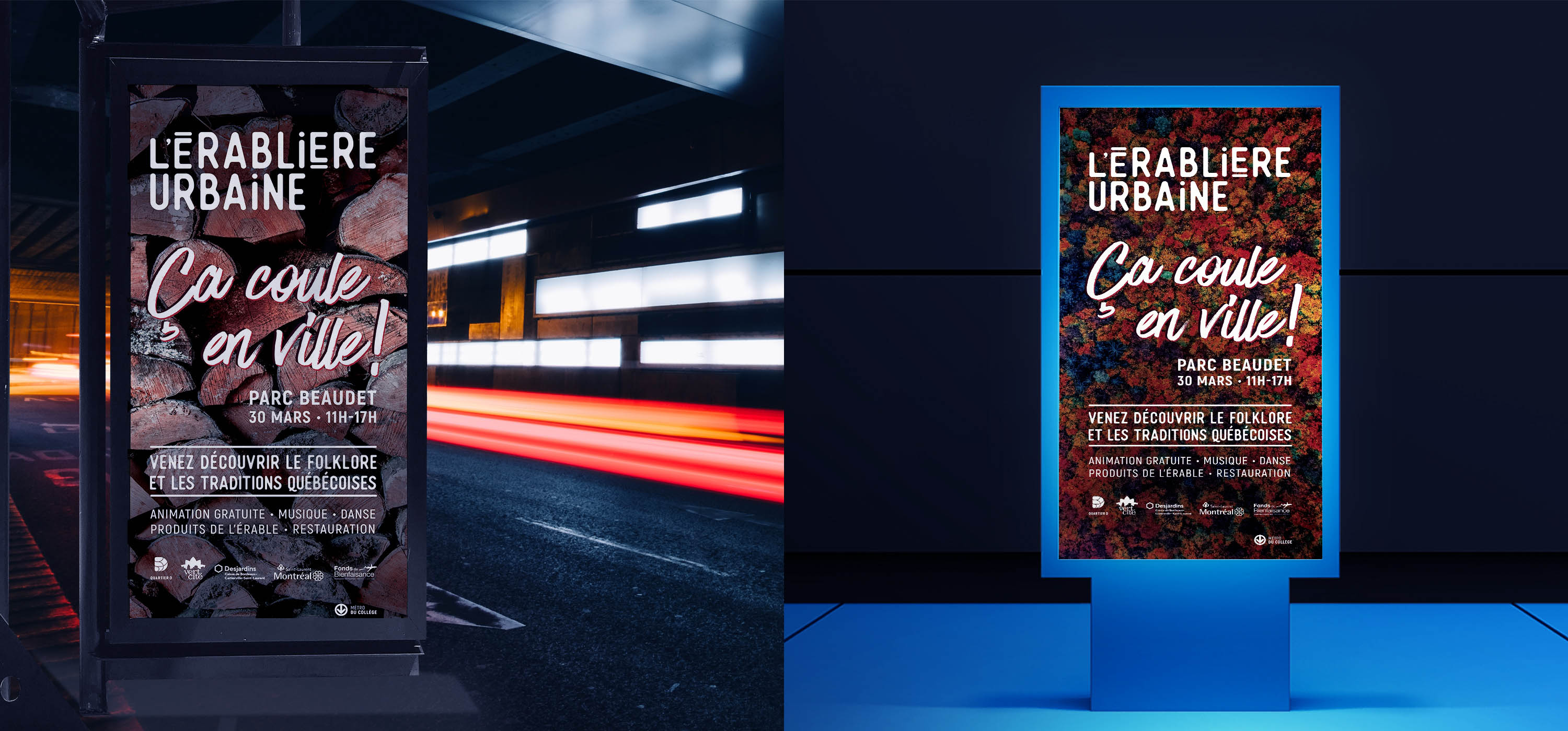
- // On-site Communications
- // Design of Key Visuals
- // Social Media Content Creation
- // Creative Copywriting
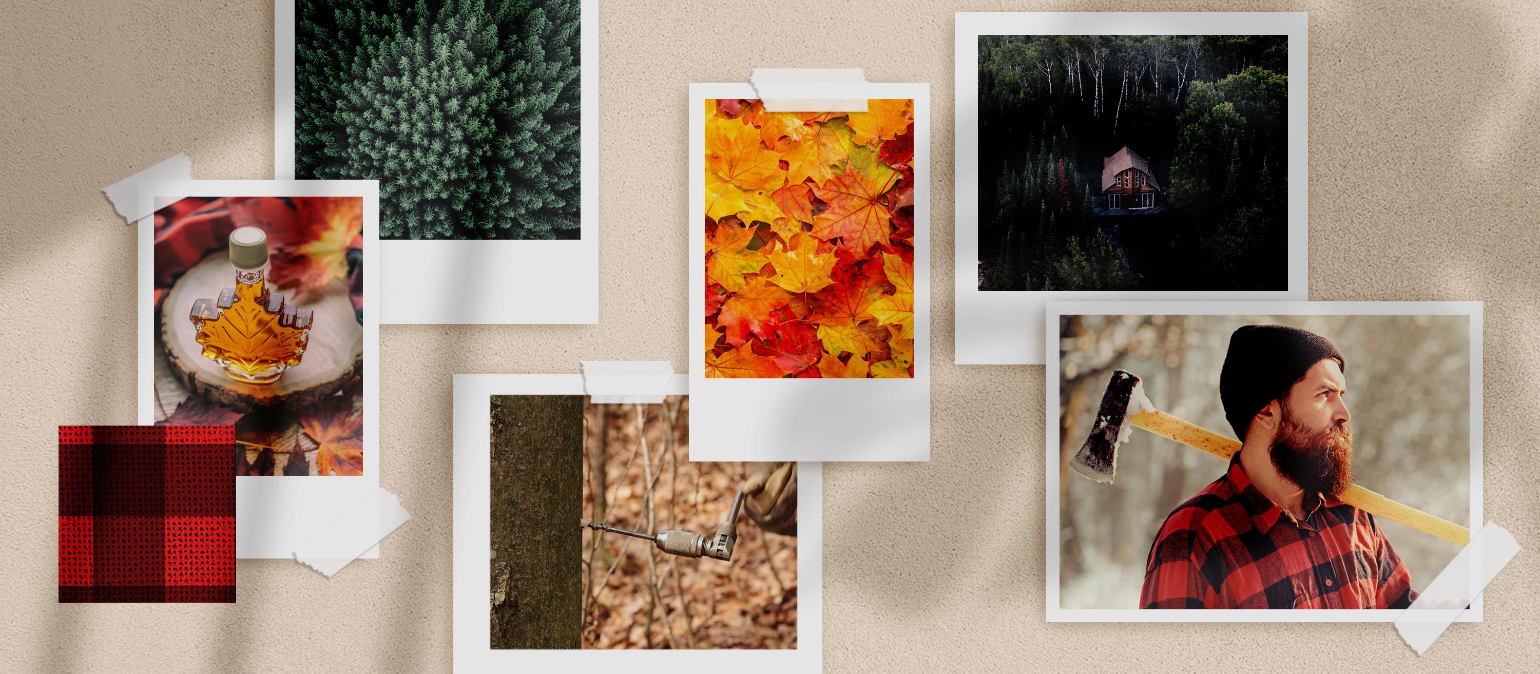
// Mood Board
Give a brand a facelift.
Just like every human being, a brand must dress to impress! Realizing that the event’s visual identity is outdated, the SDC of Quartier D chooses to give “L’Érablière Urbaine” a new look. Every logo starts with a good choice of typography; a modern yet authentic type is chosen to bring out the event’s unique character. As for the color palette, it is inspired from the variety of colors present in all kinds of maples found in Quebec. This project is mandatory for the SDC since, by associating Quartier D’s image with this particular event, the brand aims to showcase the positive change that it brings to the commercial street of Décarie.

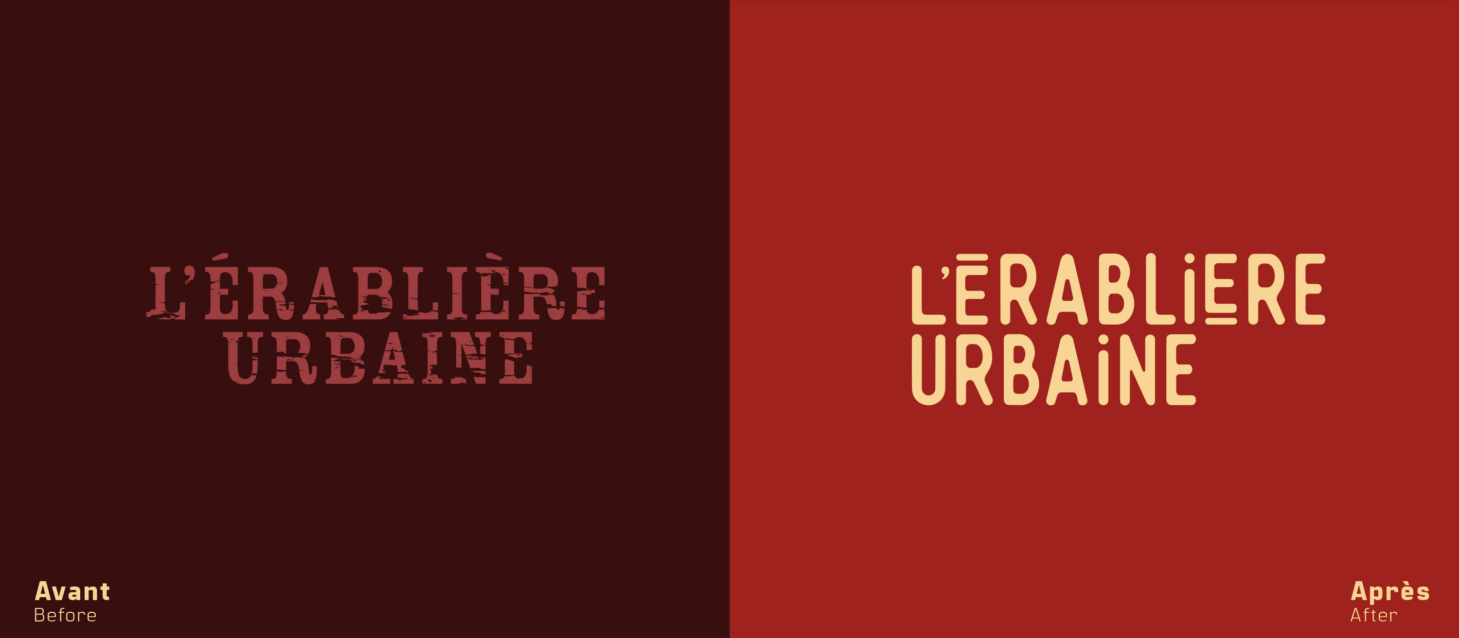
// New Logo

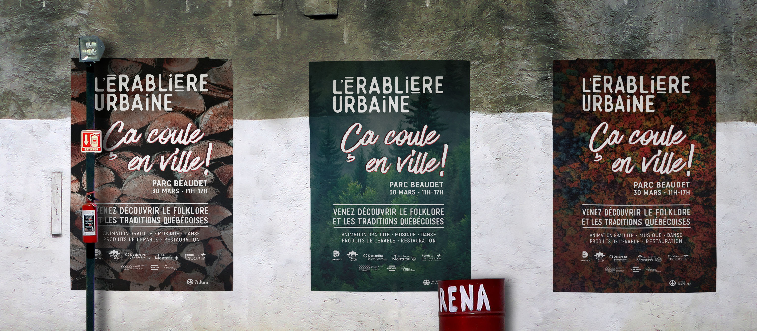
A visual style reflecting a neighborhood’s spirit.
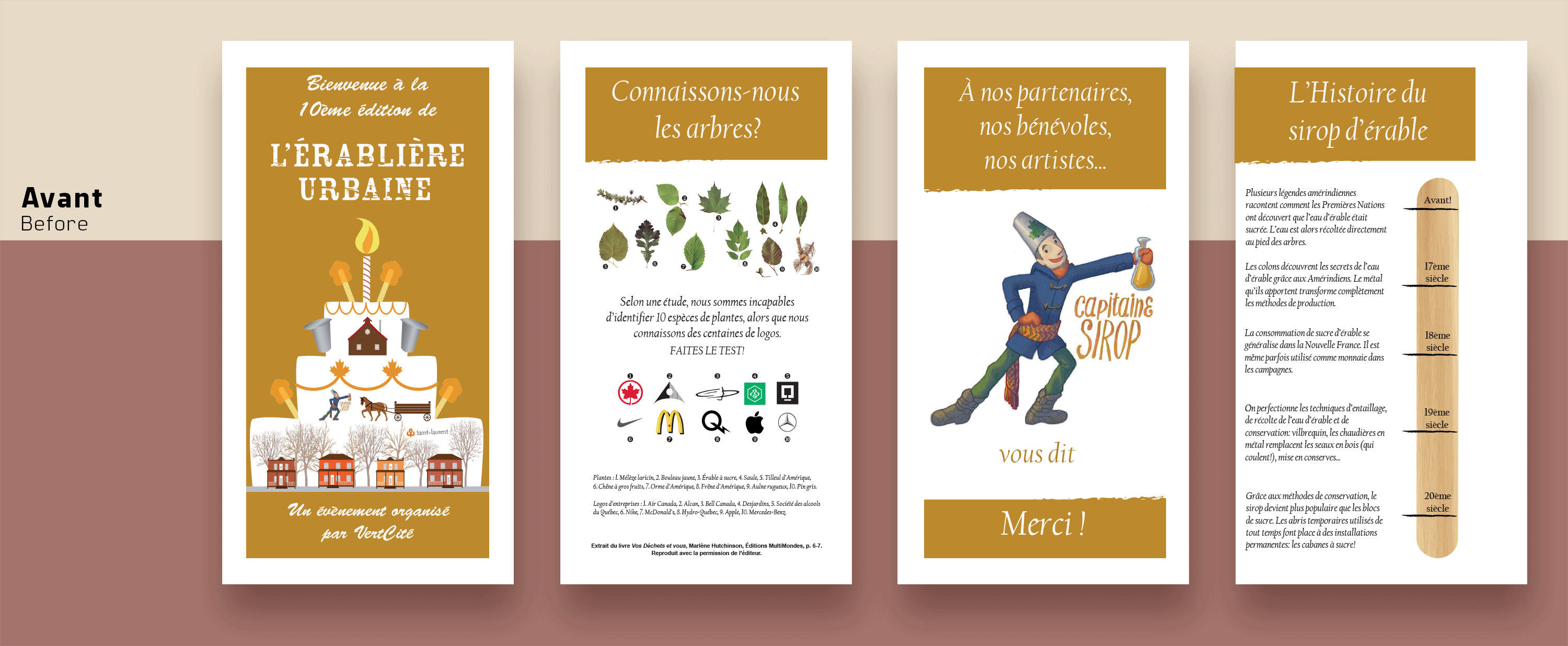
Recognized as a major event in the borough of Saint-Laurent,“L’Érablière Urbaine” can't go unnoticed. To make the campaign more effective, a new identity has to see the light of day, attracting the territory’s residents. Nevertheless, modernizing a brand’s look does not mean wiping out its identity. In fact, in the event’s communications, the focus is on its core values: folkloric and traditional spirit, bonding with nature, Quebec roots. The appropriate images are also carefully chosen in order to make the event more appealing to its target audience. To top it all off, we make sure to redesign the visuals that show off the event at the park where the latter is held in order to fit with its new modern identity.
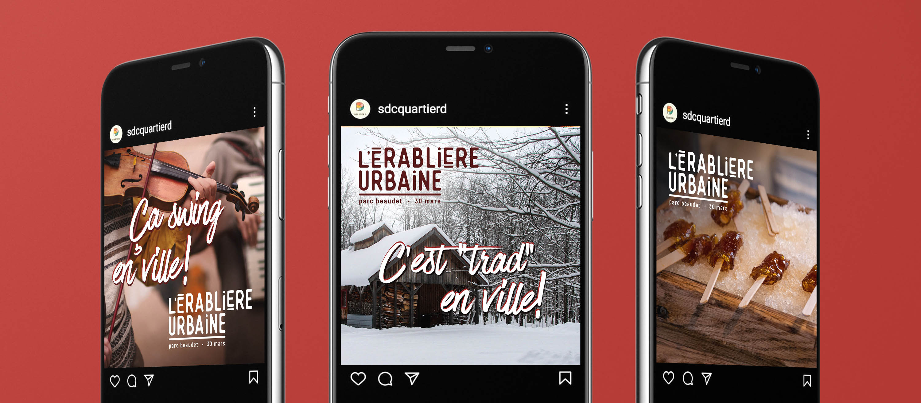
// Organic Content